Quote:
|
Originally Posted by Inhuman
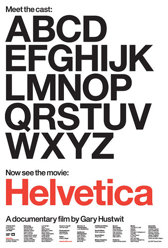
And on to more important matters than bickering (just for you LGS!)... the font there looks like another Helvetica knock off. Notice the bottom horizontal 'shaft' of the F is shorter than it should be, the U is a tad wider, and there is more of a sense of squareness in the lettering. Has anyone seen the Helvetica documentary? It's good stuff with good arguments from supporters and haters
 |
I don't get it. Someone made a documentary with a type of font as the subject? Is there really that much to be said?